Mesh Viewer
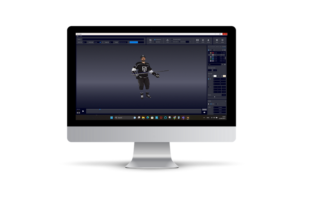
This software was designed to be an editing tool for the volumetric captures that were created in the company’s volumetric studio.
The purpose of this project was to redesign the Mesh Viewer to be easier and simpler to use. I had to focus on a few main features defined by the user, which had the most interface problems to be solved. The challenge was to make the most impact without making too complex changes to develop, focusing on improving the UX.
Platform
Role
Desktop
UX/UI Design
User Research


User Research
The first thing was meeting with the users and understanding how they use the software. During the user’s explanation, they pointed out the main issues that disturb them the most, like assets that had problems with clarifying their purpose or changing the place of some sections that will be more accessible.
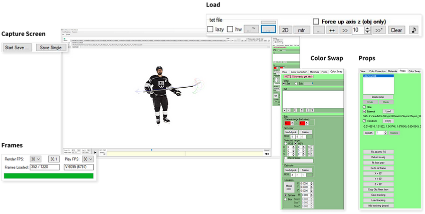
We mapped the interface to the five main sections we wanted to focus on.

Screen shot of the original screen divided to the main sections
Top Bar
When I looked at the top bar, the first thing I noticed was the use of space. Most of the space is covered with three long text fields that show the file name and location. As I understood from the users, it is necessary to see only the file's name.
Besides the text fields, two other sections needed to be redesigned: The Load section and the Capture screen buttons.
Another user request was to change the location of the Frame section which is located at the bottom. This section shows helpful information that should be more noticeable.
Redesign
In both the Load and Capture Screen sections main problems were that the buttons didn’t communicate the purpose of it. It was difficult for a new user to understand each button.
I tried to solve this problem by using icons and precise copy. I also decided to create a clear separation between the different file types that can be loaded.
The other thing I added to the top bar was the Frame section.
Frame section
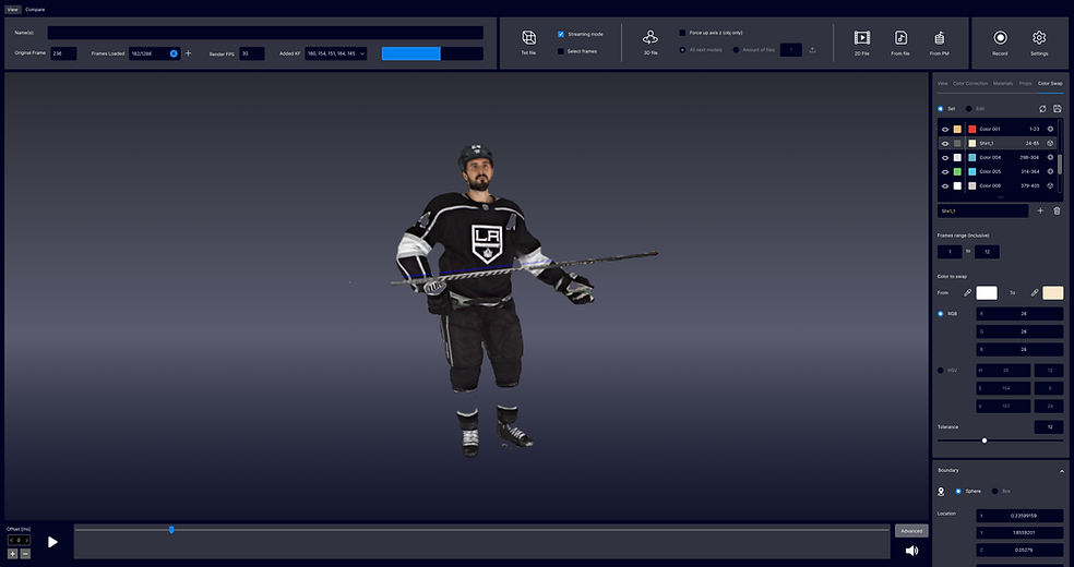
The final design including the Frame section
Load section


Side Menu
On the side menu, the users defined two sections as the most critical parts to be redesigned- Color Swap and Props.
Color Swap
With this tool, the user can make a color correction to the model.
The main problem was the list of color changes. The information n the list wasn’t clear, so if the user wanted to edit a specific color change, he would have to go over the list until he found the specific change. The user’s request was to organize the information on the list so that it will be clear.
We decided to add a few things that could solve that:
1. Showing the original color and the new color.
2. Adding the ability to change the color correction name.
3. Hide/ show option.
Props
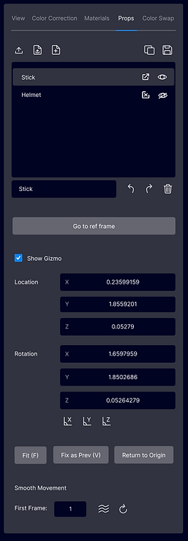
This tool is designed to insert an external prop and position it according to the model.
The user's main request was to have a navigation tool that will give them the ability to place the prop in an accurate position.
To make the Prop a clear tool to use, I focused on organizing the interface according to the order and type of use.
Color Swap
Props


Final Design
